Stars – some designs carry over the only symbol on the existing flag that remotely relates to NZ – the Southern Cross. But it’s easily confused with Australia’s current flag [this could change]. It is less recognised in the more populous northern hemisphere, from where this star constellation is not seen. Stars are a clich8Ed, commonplace feature of many national flags.
Interestingly, the four stars of the Southern Cross were proposed in the late 19th century, ‘but were rejected as not being exclusively representative of New Zealand’[NZ History online]

Ferns – A symbol sometimes thought to be special to NZ is the fern. However, there are thousands of fern species throughout the world and they’re especially abundant around the equator, tropics and sub-tropics.
The fern makes an attractive symbol, but the plant is far from unique to NZ. Overseas, the fern is not normally or naturally associated with NZ. Unlike the kiwi bird, for example, there is nothing about the fern that is exclusive to NZ, or represents New Zealand necessarily. Some see it depicted on TV and in photos abroad and imagine that it must be widely known around the world.
Some past flag attempts combine too many – and too disparate – elements in a single flag. The result can seem as though gathered by a committee as a compromise collection. Others are good designs of themselves but perhaps not ideal to represent the whole country.
• TO avoid? – The design goal of a new flag should be more than to omit the Union Jack and then re-hash the current flag in terms of colours, stars and maybe one or two other things.
Some of the world’s flags seem to come from some standard identikit-pak of flag elements of stripes and stars.
Parallel bands of colour, arranged vertically or horizontally, are a hackneyed feature of too many world flags. Those colour blocks are often anonymous.
Because such styles are often meaningless to outsiders, if there’s any interest, they need explanation and interpretation.
A new flag is an opportunity to break away, not only from tradition, but also from tired commonplace convention.
A design should avoid being cold, stark, severe or funerial. For international benefit, signs and symbols should avoid being trite, derivative, unrecognisable or easily confused with the flags of other countries.
We are a proud, confident country, but we’re not a nationalistic nation.
The need for overt cultural or historical references is perhaps not as strong as for other nations, partly because NZ was the last habitable territory on Earth to be settled by humans – just one of the things that make this land special.

The current flag – with the Union Jack at the top left – is probably liked by the British people, because it shows their flag in our corner.
The relationship has been of great benefit in the past, but Britain’s interest in NZ – as well as its relative position and power in the world – has waned in the last 110 years.
For a few in the world, the British connection does not always have the positive connotation it does for the vast majority of New Zealanders.
To serve for at least the next 110 years, in an uncertain world, the safest path to follow is likely to be a neutral design that is not linked to, or associated with, any one other country.
• WHAT’s needed? – A design ought to symbolise, without necessarily being a symbol. It should unify and be unique. And fresh, special, honest, original, confident, welcoming and noticeably different from the flags of all other nations.
Partly in order that it can easily be re-purposed, we should take the opportunity to consider a design that doesn't necessarily look like a conventional flag.
Ideally, a design or theme should reference the truth, that our land is amongst the most beautiful parts of the planet. New Zealand is more than one sports team and more than one culture. And the following Proposal is more than a compromise candidate. Aotearoa is no less than our island land of the long white cloud and everything on these islands.
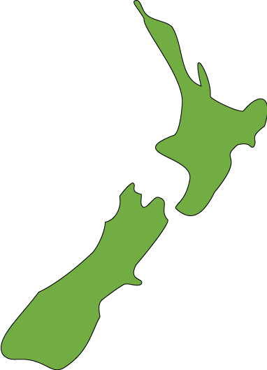
One of the basic tools in primary education around the globe is the atlas and the world map. What if a design were modelled on the unique, distinct-ive shape of the north and south islands? How likely would it be, that people abroad would be in doubt as to which country was represented by such a symbol?
No comments:
Post a Comment